Branding
– From conception to execution, a few brands built and developed...


Room 2046
Developed Room 2046 from conception to a lifestyle brand with global outreach. With emphasis on tasteful design and quality craftsmanship, I began my entrepreneurial journey in 2011 to source and curate a collection of whimsical, one-of-kind products from various countries. In May 2012, Room 2046 officially opened its doors to the public in the Summerhill / Rosedale neighbourhood of Toronto, establishing itself as a concept shop – offering an eclectic selection of apparel, accessories, jewellery, cards, books, housewares – with a cafe serving artisanal coffee and a creative studio producing items ranging from screen-printed goods to scented soy-wax candles. Since its inception, Room 2046 has received local and international press coverage that included Designlines, Post City, NOW Toronto, Chatelaine, Toronto Life, Food & Drink magazines, and has appeared in the Toronto edition of the The Monocle and The Hunt Travel Guides. After five years or so, the bricks-and-mortar shop closed its doors in the summer of 2017; however, its online shop is still operating.
Brand Identity
I designed the brand identity and incorporated a sleek, slim style into the letterpress business cards and price tags. Also a focal point of the space upon entering, the illuminating neon sign (based on the logo) was used consistently as a design element in other Room 2046's promotional and marketing materials, as seen on the postcards and re-loadable gift cards, and at times, on the e-newsletters as GIFs.


Interior & Furniture Design
In conceptualizing and designing the interiors, I collaborated with Florent D'Heilly, an Art Director based in Paris, France to convert a 1,334 square feet unit into an industrial chic retail boutique that also operated as a cafe with a back room used for work and storage purposes. Given the limited budget and time constraints, we chose concrete, pine wood, and MDF as the main materials. As a result, concrete appeared as the dominating and featured element that unified and connected the elongated space. Punctuated by touches of mid-century classic furniture and softened by the presence of blonde wood amidst the canvas of white walls, the aesthetics reflected the products displayed – a mix of high and low, a juxtaposition of grit and beauty, a contrast of (slight) vulgarity and elegance.


– Intended to be airy and open, the space allowed visitors to move around and browse comfortably with a cup of latte in-hand. We encouraged customers to 'sip & shop.'

– Along with other pieces, I designed this multipurpose shelving unit and had it made locally

Window Displays


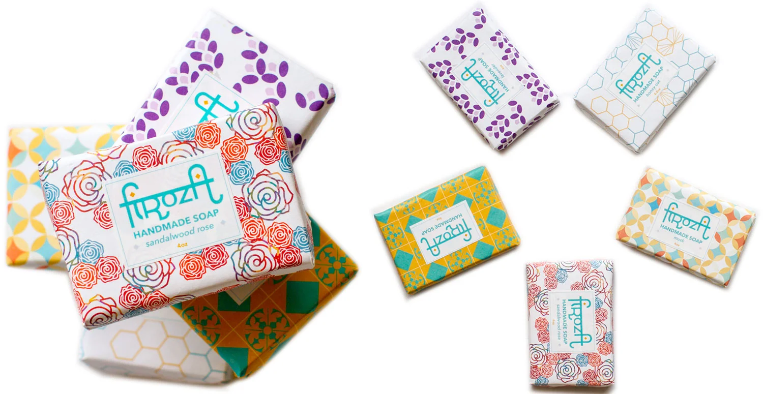
Firoza
In providing consultation for this all-natural skincare company based in Toronto, I was involved in the development of Firoza as a brand from conception to fruition. Working closely with the founders/owners, I designed their logo along with the tile-like patterns embellishing the containers and wrapping their exquisite handmade soaps. After having in-depth conversations and learning about how founder, Nidhi Sachdeva draws from her Indian heritage, memories of living in India as well as her knowledge of ayuverda to create the exquisite collection, I wanted to incorporate the vivid colours and bold patterns – reminiscent of the gorgeous textiles and symmetrical architecture found in some regions in India – with subtle design elements to depict the main ingredients found in each product. In addition, I developed the copy for each product label and the tagline "nature to skin."